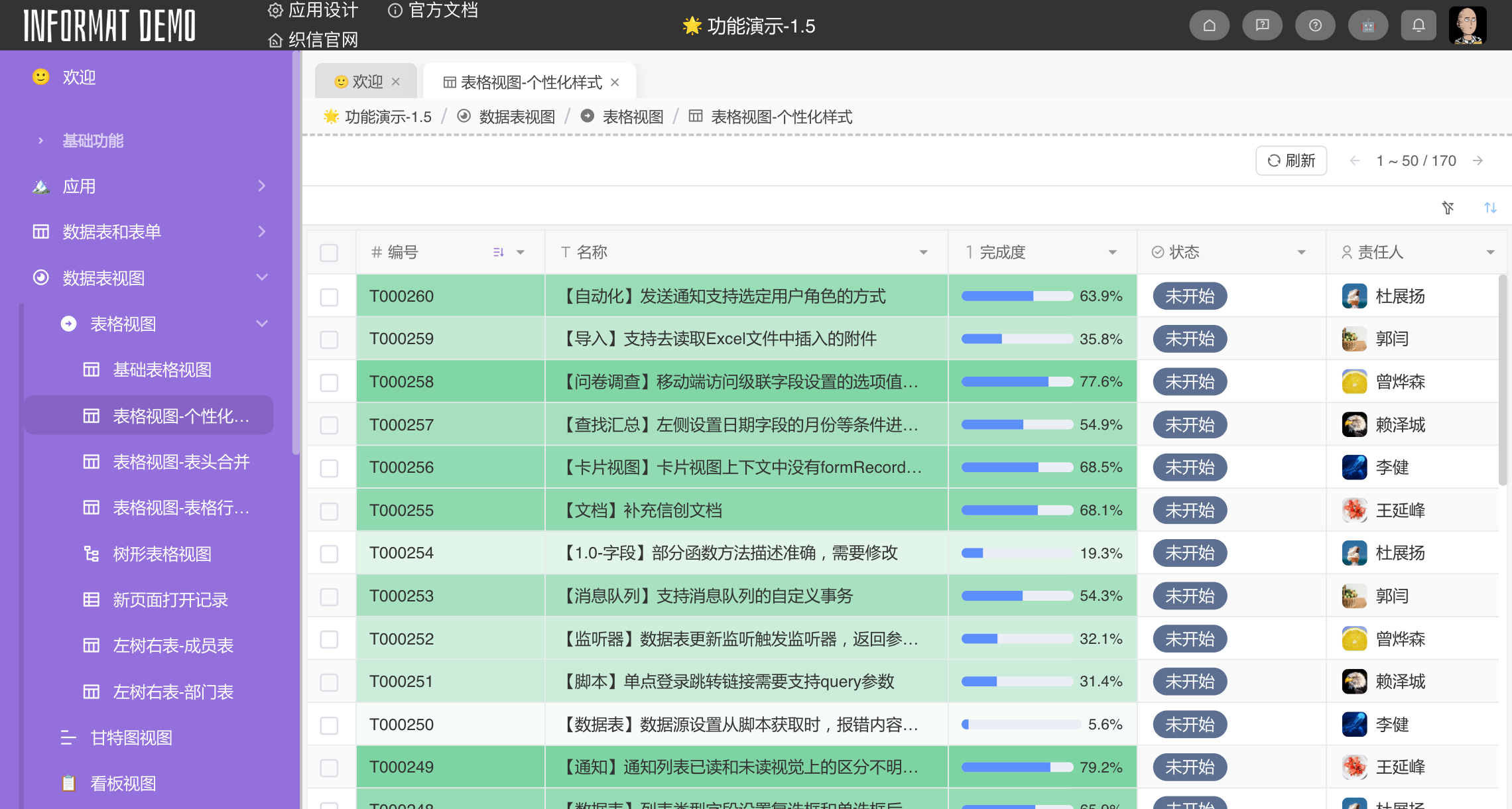
Grid View
Overview
The Grid View displays data in a table format, supporting pagination, drag sorting, row height adjustment, cell styling, inline editing, and other features.
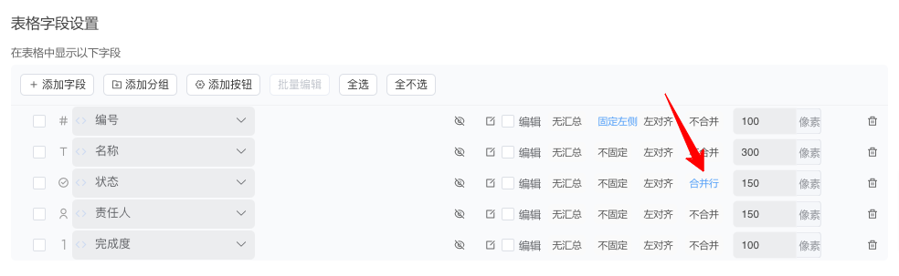
Table Style Settings
Mainly used to configure the table's row height, font size, border display, styles (such as showing serial numbers, stripe backgrounds, etc.), as well as grouping fields, summary methods, and selection modes to optimize the table's visual effects and interactions.
Behavior After Cell Editing
This function mainly controls whether to automatically activate editing of the next item after cell editing, to facilitate quick filling of table data. The default is Inactive.
- If set to
Inactive, nothing happens after the active cell loses focus. - If set to
Automatically activate next row, after the active cell loses focus, the cell in the same column of the next row will be activated and enter edit mode. - If set to
Automatically activate next column, after the active cell loses focus, the next editable cell in the next column will be activated and enter edit mode. If the current column is the last column, the first editable cell in the next row will be activated.
Cell Style
Use expressions as judgment conditions to set individual cell styles for rows that meet the conditions.
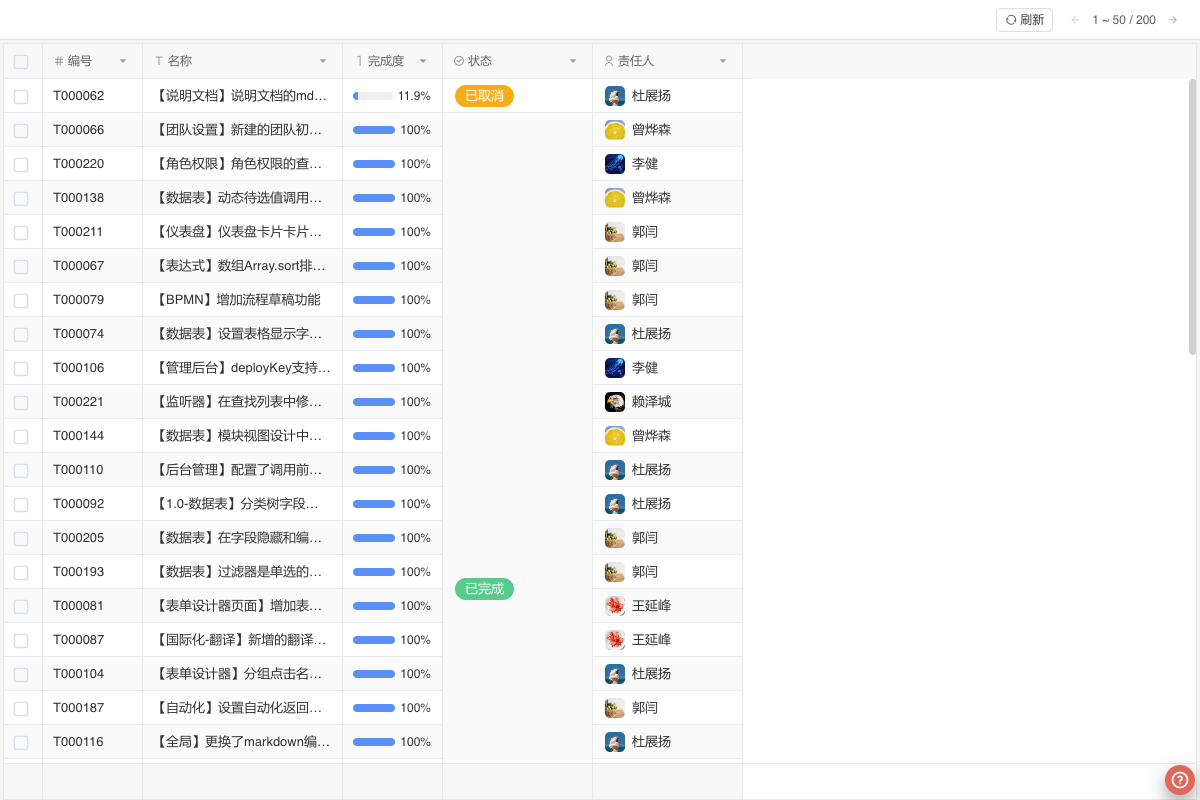
We will provide an example where the background color of cells is set based on the percentage of completion in the task management data table.
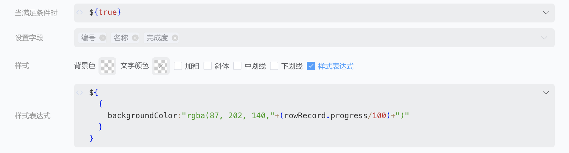
Style Expression
The data structure returned by the style expression is a JSON object based on the style sheet. The key is the style name, and the value is the style value. If the style name uses - separation, it will be converted to camelCase here. For example, the style background-color will be converted to backgroundColor.
Style sheet:
background-color: #fff
font-weight: 700Converted to style expression:
{
    backgroundColor: '#fff',
    fontWeight: 700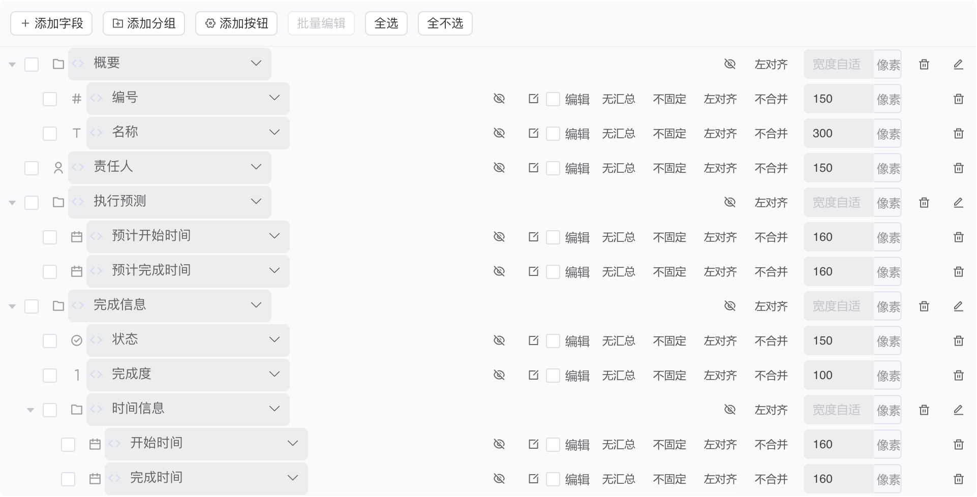
}Table Field Settings
This feature allows users to customize table field display, editing, sorting, table operation buttons, and other attribute settings. Both display and edit states support control through expressions.
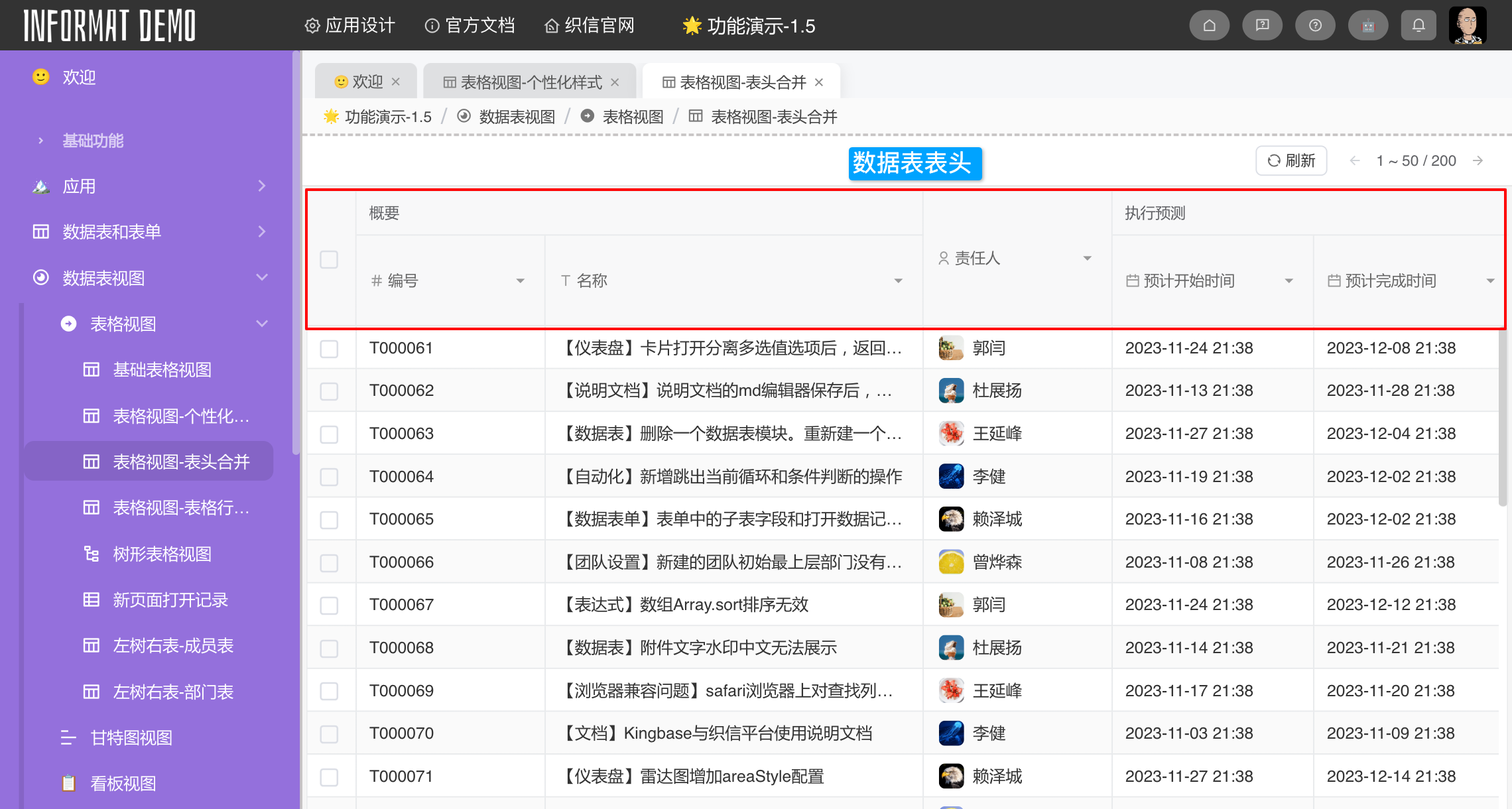
Header Merging
Supports grouping table headers by adding field groups, and supports multi-level headers.
Row Merging
Supports setting merged rows for display fields, where consecutive identical data in the field rows will be merged into a single cell.