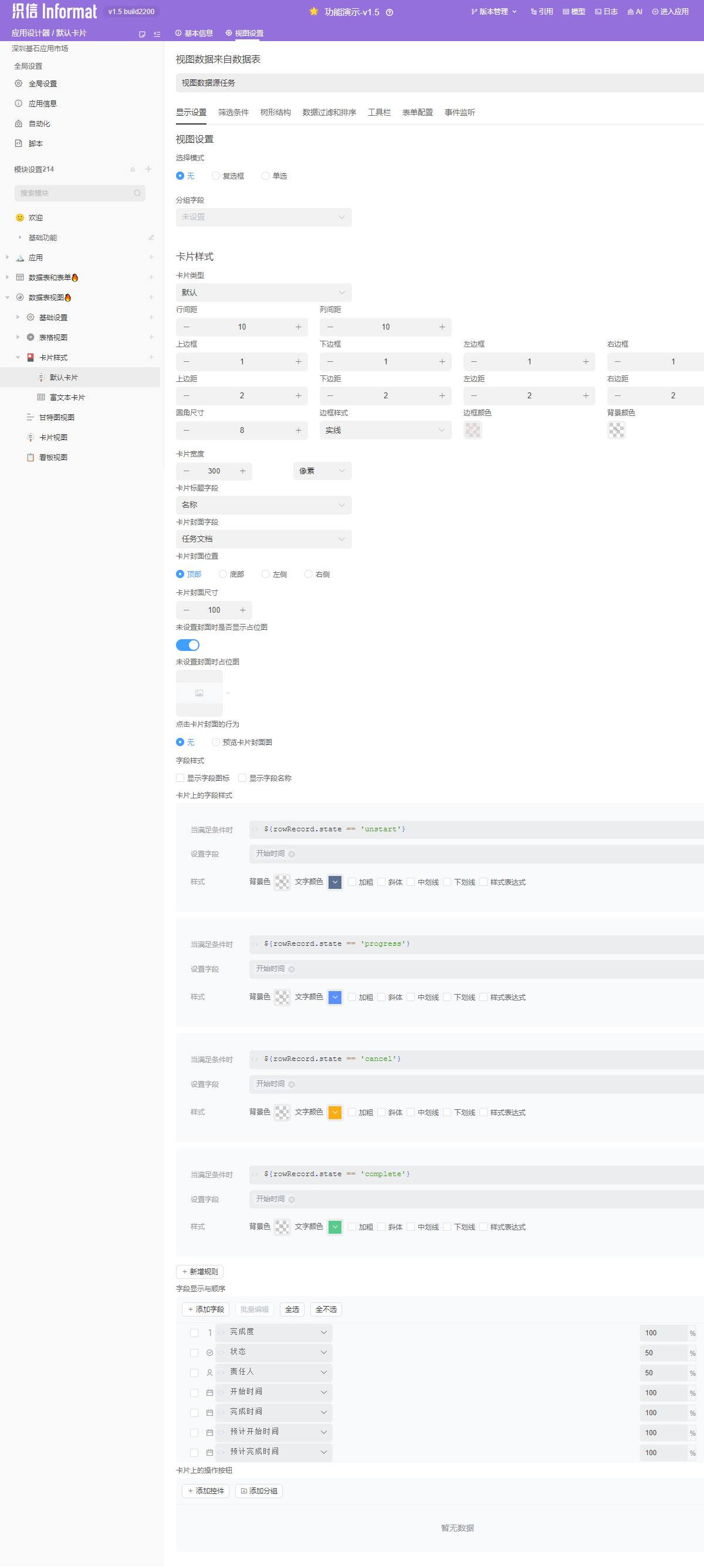
Card Style
This refers to the style settings for the card part of the view, which is used in Card View, Kanban View, and Timeline View. We will explain this uniformly in this chapter.
Card Structure Description
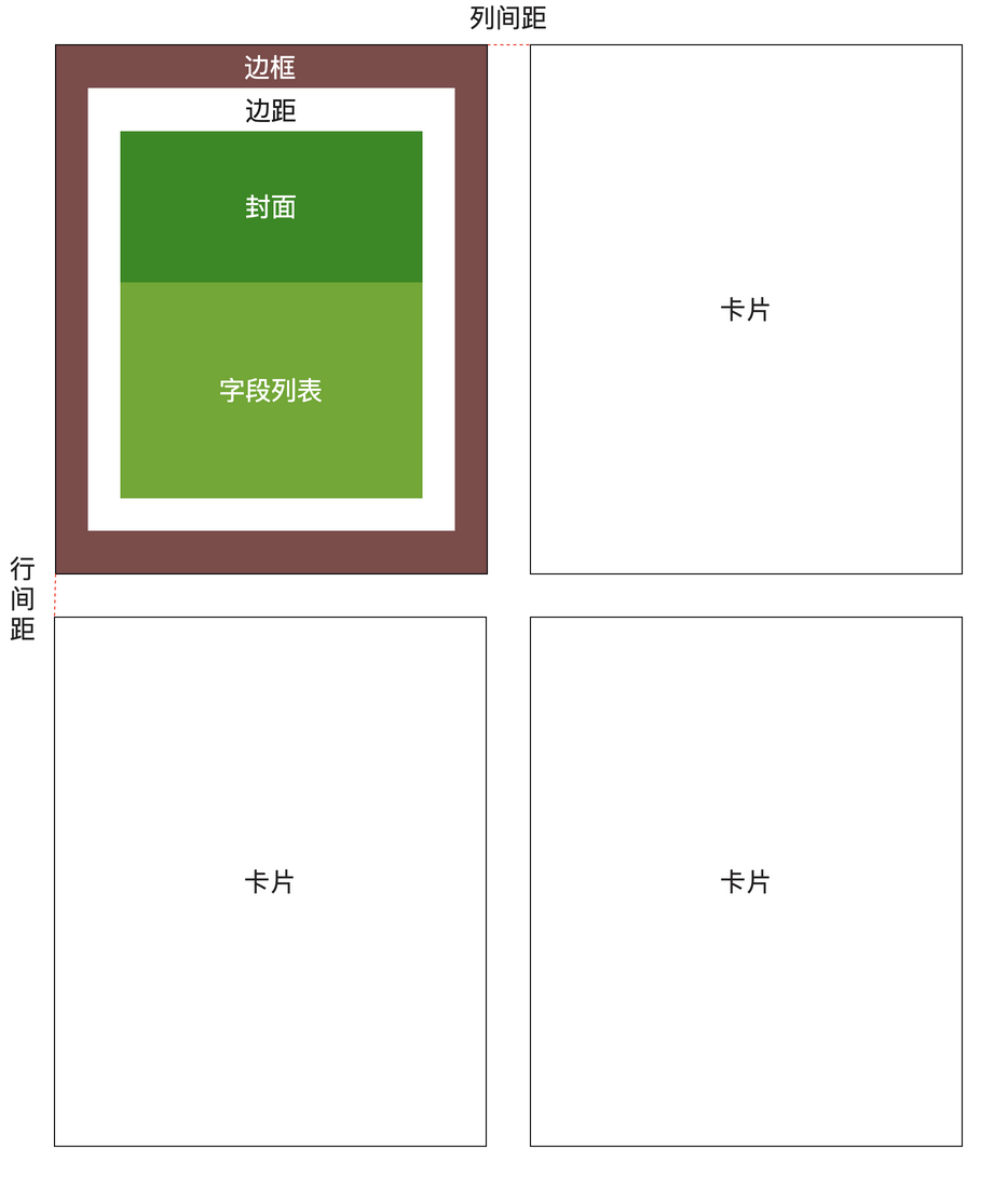
Rendering Methods
Cards have three rendering methods: Default, Rich Text, and Custom Component. The following will demonstrate the different configuration methods for these three cards through examples.
Data Table Definition
The following examples will all use the Task Table as the data source. Here is the specific data structure:
| Identifier | Field Name | Field Type | Description |
|---|---|---|---|
| no | Number | Number | Number calculation expression: T${String.lpad(seq,6,'0')} |
| name | Name | Single Line Text | Task name |
| progress | Completion | Decimal | |
| state | Status | List Selection | Options: Not Started, In Progress, Cancelled, Completed |
| who | Responsible Person | User Selection | |
| startDate | Start Time | Date | |
| planStartDate | Planned Start Time | Date | |
| planFinishDate | Planned Finish Time | Date | |
| finishDate | Actual Finish Time | Date | |
| descs | Task Description | Rich Text | Business field |
| docs | Task Documents | Attachment | Business field |
| taskChildren | Sub-tasks | Sub-object | Used to build tree structure |
Status Enumeration Values
| Option | Identifier |
|---|---|
| Not Started | unstart |
| In Progress | progress |
| Cancelled | cancel |
| Completed | complete |
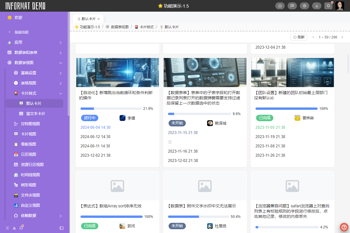
Default
Render using simple system configurations and system-preset card styles.
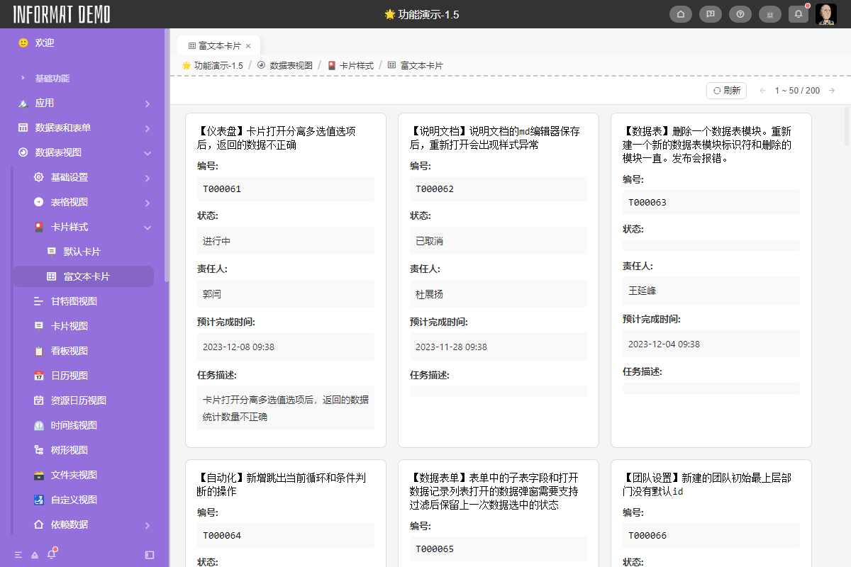
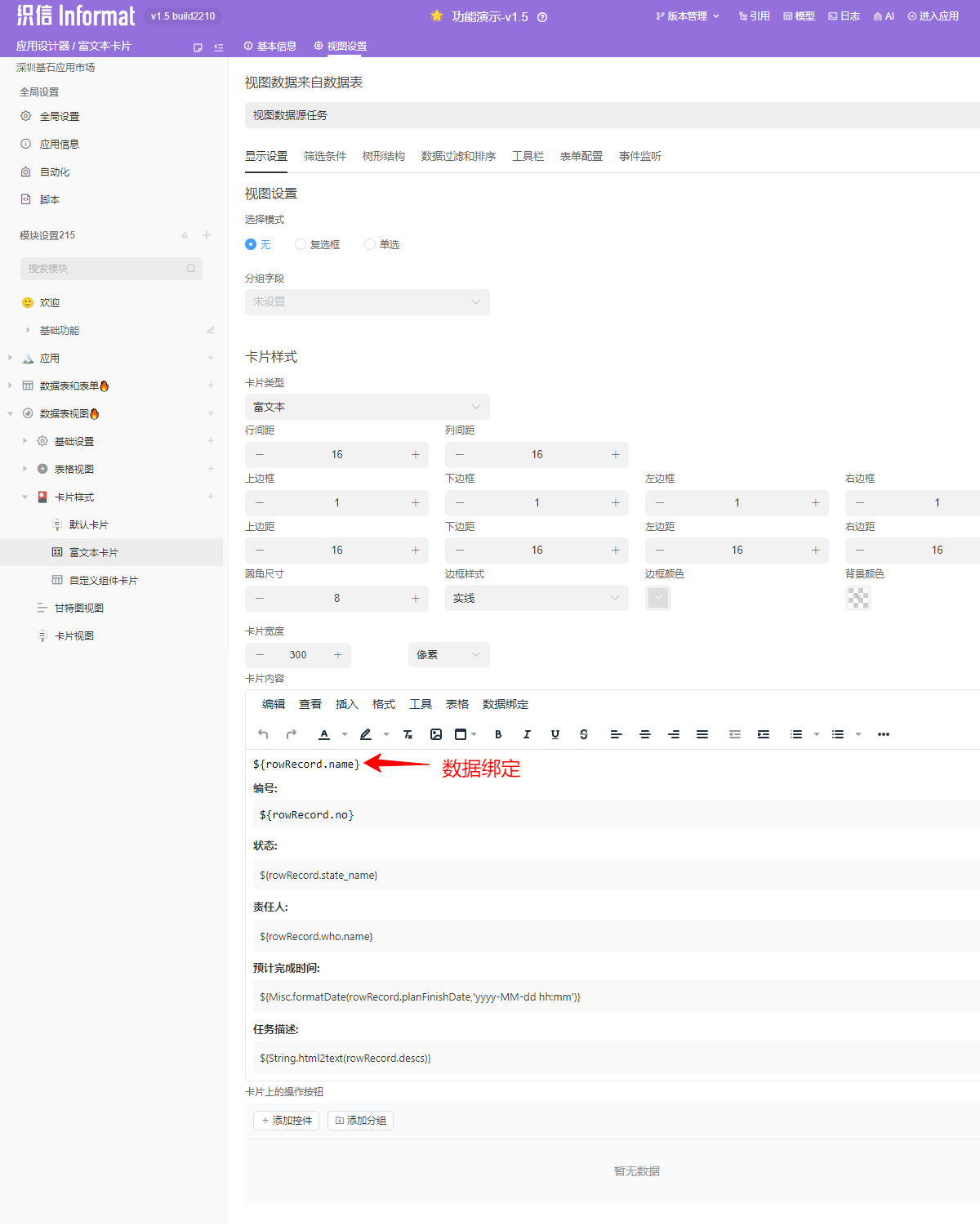
Rich Text
Custom rendering using a rich text editor, supporting data binding methods for rich text. The following will explain the use of Rich Text cards through an example. For specific rich text-related knowledge, please view the relevant chapter documentation.
Card Content
The content of rich text cards only includes the definition of card content. Styles such as card borders, padding, column spacing, and row spacing need to be defined through card styles.
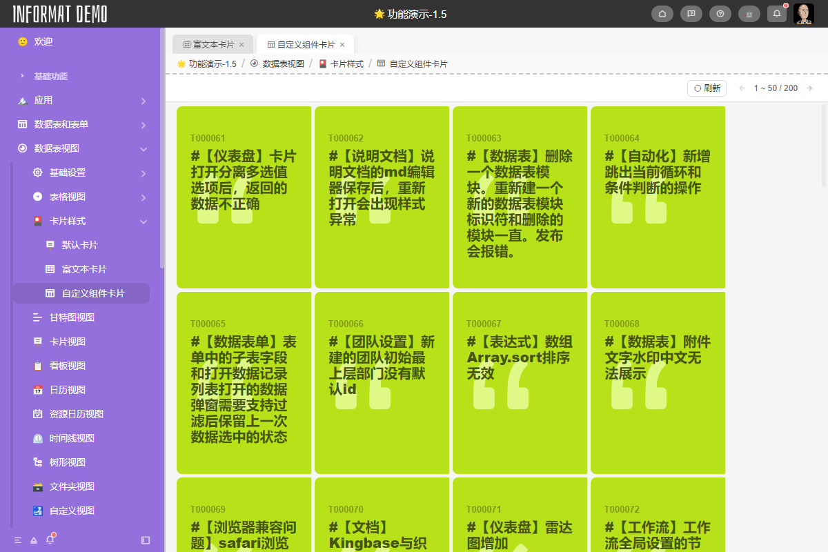
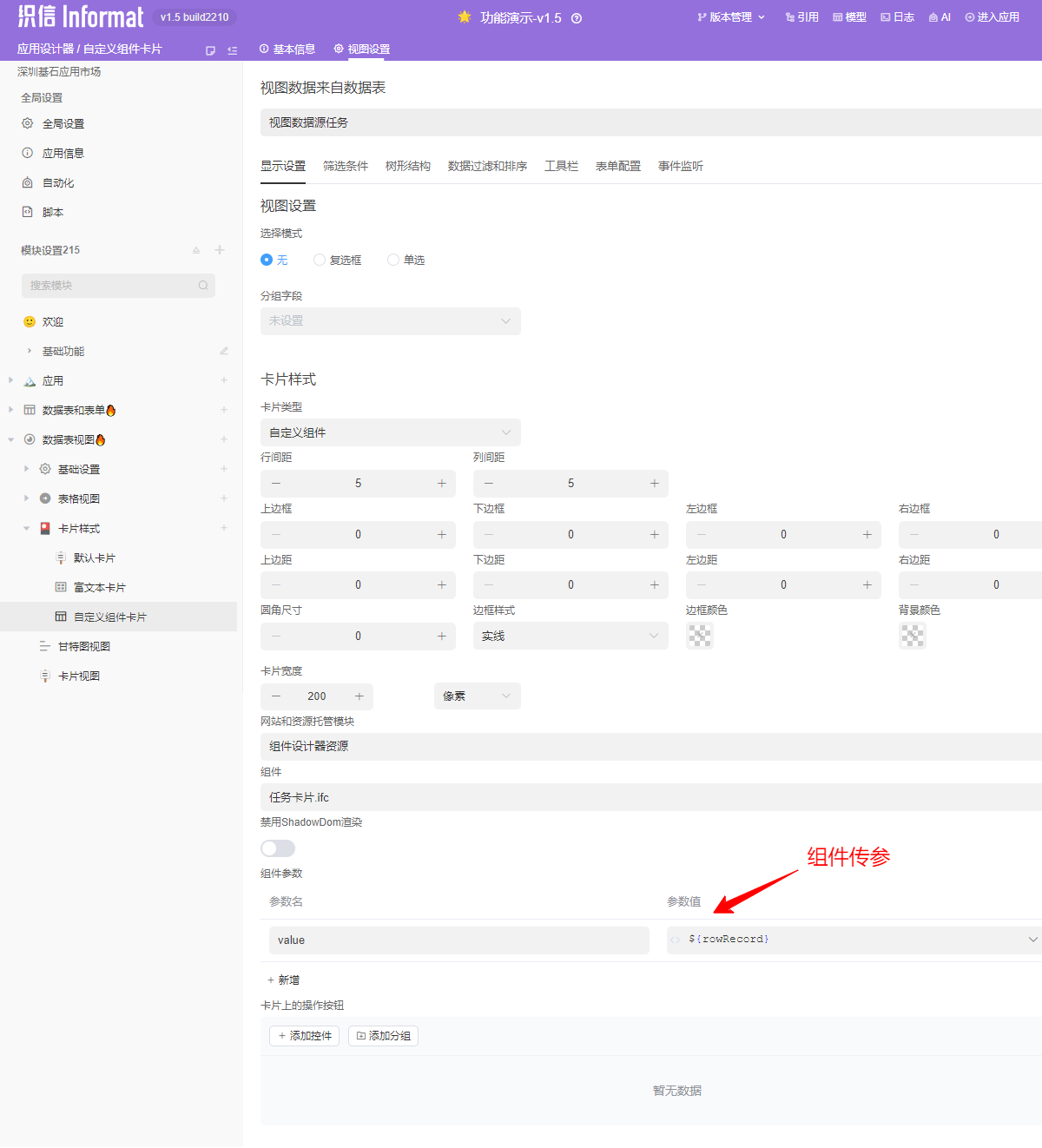
Custom Component
Custom rendering using the Component Editor, supporting passing the current view's context to the component through component parameters. The following will explain the use of Custom Component cards through an example. For specific Component Editor related knowledge, please view the relevant chapter documentation.
Card Content
The content of custom component cards only includes the definition of card content. Styles such as card borders, padding, column spacing, and row spacing need to be defined through card styles.