Chapter 4 Global Settings for the Application
So far, all our work has focused on the "interior decoration" — creating data tables (room layout) and configuring views (furnishings in the room). However, a complete application also needs a unified appearance style and clear navigation structure, which is the mission of "global settings".
In this chapter, we will learn how to adjust the application's name, icon, color theme, and most importantly — the layout of the navigation menu. These settings will define users' first impression when interacting with your application.
4.1 Accessing Global Settings
First, we need to find the entry point for global settings.
In the top-left corner of the "Application Design" interface, you will find a configuration entry called "Global Settings". Clicking on it will take you to the application's "control room".
4.2 Overview of the Global Settings Panel
After clicking, you will see a feature-rich configuration page (as shown below).
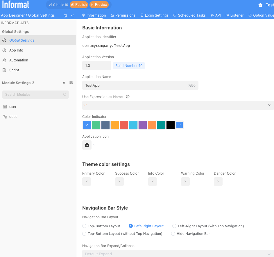
This panel controls all aspects of the application, from basic information to navigation style, and advanced API configuration. For a quick start, we will focus on the parts that have the most direct impact on user experience.
Section 1: Basic Information ("Naming" Your Application)
This is the application's "ID card", defining its most basic identification.
Application Name: If you are not satisfied with the current application name, you can modify it here at any time.Color Palette&Application Icon: This is where you shape the application's "brand image". You can choose a color that represents the application theme and replace it with a more recognizable icon. This icon and color will be displayed on the Informat workspace homepage, allowing users to find your application at a glance.
Section 2: Navigation Bar Style (Determining the Application's "Framework")
This is the most core part of global settings with the greatest impact on user experience. It determines the main path and way users navigate through the application.
Top-bottom layout: The application's navigation menu will be arranged horizontally at the top of the page like a website. This layout is concise and intuitive, suitable for applications with not too many menu items.Left-right layout: The navigation menu will be arranged vertically on the left side of the page. When your application has many functional modules (i.e., future menu items), the left-side tree navigation can better organize and expand.Do not display navigation bar: This is a special mode, usually used when embedding Informat pages into other systems or using dashboards as the only entry point for the application.
4.3 Hands-on Practice: Personalizing Your Employee Management System
Now, let's personally carry out an "overall image design" for our "Employee Information Management System".
Change the theme color: In the
Color Palette, select a color you like that represents education and vitality, such as green.Modify the icon: Find the
Application Iconsetting and select an icon you like.In the
Navigation Bar Style, selectLeft-right layoutPublish the application!
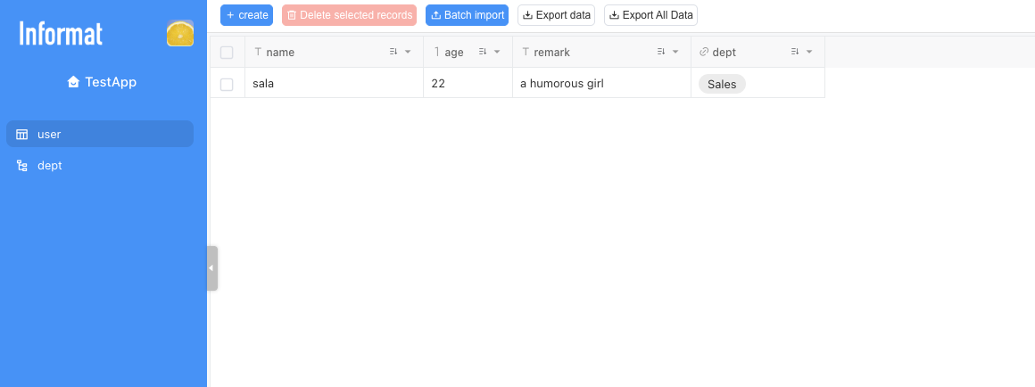
Go to the frontend to see the effect
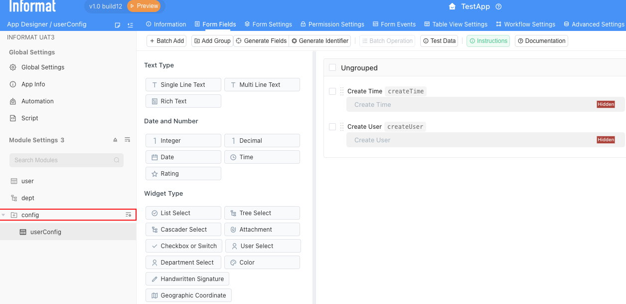
4.4 Adding Module Groups
At this point, you can continue adding data table modules according to business needs following the operation methods in Chapter 3. If you have too many modules, you can also add groups to put a class of modules with related functions into the same group. In the end, you can create a complex system with sufficient functionality to manage all aspects of your business!