Chapter 3: Insight into Data Pulse - Building Visual Dashboards
Often, for a department or company executive, what they care about daily is not specific data, but more macroscopic questions:
- "Is the human resource load of our R&D department too high? What is their total leave duration?"
- "How is the new employee onboarding trend in the first half of this year? Are there any fluctuations?"
- "Among all approved leaves, which type (annual leave, personal leave, sick leave) accounts for the highest proportion?"
- "Is the number of employees in each department reasonable?"
If answering these questions still requires you to manually export Excel from data tables, then perform calculations and plotting, your application is still not intelligent enough.
Informat's dashboard module is the 'intelligent cockpit' and 'business radar' equipped for your application. Its core mission is to transform the massive information stored in your data tables into real-time, intuitive, and interactive visual signals through various card components (such as line charts, pie charts, statistical numbers). Managers only need to open the dashboard to grasp the overall operational status at a glance, thereby achieving data-driven decision-making.
In this chapter, we will practice how to transform data from the [Employee Table] into a professional "Human Resources Dashboard".
3.1 Core Concept: The "Puzzle" Art and Data Wisdom of Dashboards
Dashboards themselves do not store data; they are just display tools for data. They extract, calculate, and display results from data sources.
A dashboard consists of many different types of cards, which are the "building blocks" and "exhibits" you use to display data.
- Diverse card types: Informat provides up to 25 types of cards, covering almost all business scenario needs:
- Chart class: Line chart, bar chart, pie chart, radar chart, funnel chart, etc. (11 types), used for trend analysis, proportion display, and multi-dimensional comparison.
- Data class: Statistical numbers, data tables, pivot tables, used to highlight key indicators and display detailed data.
- Control class: Rich text (for displaying instructions or titles), countdown, buttons, etc., used for page layout and enhancing interaction.
- Container class: Tabs, accordion panels, etc., used to organize complex card groups.
- Grid layout: The dashboard layout adopts a flexible 24-column grid layout. You can drag and adjust the size and position of cards like playing a puzzle game, precisely controlling their width (up to 24 columns) and height on the page, achieving professional and beautiful typesetting.
3.2 Core Capability Source of Dashboards: Aggregation Queries
1. Why do we need aggregation queries? - From answering "how many" to "how much"
In dashboard design, our most basic need is to understand the quantity of data. For example, we use charts to answer:
- "How many people are in each department?"
- "How many orders did each salesperson sign?"
In in-depth business management, managers are often more concerned with the value behind the data. They will ask more profound questions:
- Sales director wants to know: "What is the total sales amount of each sales team this month?"
- HR director wants to know: "What is the average salary level of each department in the company?"
- Project director wants to know: "Among all completed projects, which one has the highest cost?"
These questions require complex mathematical calculations such as summing, averaging, finding maximum/minimum values on specific data.
Aggregation queries are powerful features designed to meet this series of analysis needs from "counting" to "calculating". They enable your dashboard to analyze and gain insight into business from multiple dimensions and levels.
2. What are aggregation queries?
Aggregation queries are a data processing method. Its core idea is divided into two steps:
- Grouping: First, the system will "categorize" data according to the dimensions you specify. This dimension is the "dimension" field we set in the chart earlier, such as grouping by "department" or "salesperson".
- Aggregation: Then, the system will perform a "summary" calculation on the data in each group.
Common types of "summary" calculations include:
| Aggregation Type | Name | Description | Scenario Example |
|---|---|---|---|
| Count | Count | The most basic aggregation, counting the number of data records in each group. | Calculate the "number of employees" in each department. |
| Sum | Sum | Add the values of a certain numeric field of all records in the group. | Calculate the total "salary" of all employees in each department. |
| Average | Average | Calculate the average value of a certain numeric field of all records in the group. | Calculate the average "age" of employees in each department. |
| Maximum | Max | Find the maximum value of a certain numeric field in all records in the group. | Find out the highest amount order in each sales region. |
| Minimum | Min | Find the minimum value of a certain numeric field in all records in the group. | Find out the lowest quotation among materials provided by each supplier. |
In summary: Aggregation queries are "first group, then summarize". They allow you to choose the most appropriate summary method (from counting to complex calculations) according to business needs, thereby obtaining more insightful analysis results.
3. Specific enterprise management examples
Let's look at several scenarios in company management where different aggregation queries work together:
- Scenario 1: Sales performance analysis
- Data table: [Order Table], including fields:
Salesperson,Order Amount,Signing Date. - Basic analysis (counting): Group by
Salesperson, select Count as the aggregation method, you can get the "order quantity ranking of each salesperson". - Advanced analysis (sum/average):
- Group by
Salesperson, select SumOrder Amountfield as the aggregation method, you can get the "total performance ranking". - Group by
Salesperson, select AverageOrder Amountfield as the aggregation method, you can analyze "average customer unit price per person".
- Group by
- Data table: [Order Table], including fields:
- Scenario 2: Human resources analysis
- Data table: [Employee Table], including fields:
Department,Salary. - Basic analysis (counting): Group by
Department, select Count as the aggregation method, you can get the "number of people distribution map of each department". - Advanced analysis (sum/average):
- Group by
Department, select AverageSalaryfield as the aggregation method, used to analyze and adjust "average salary level of each department". - Group by
Department, select SumSalaryfield as the aggregation method, you can get "human resource cost budget of each department".
- Group by
- Data table: [Employee Table], including fields:
Through the above introduction, I believe you have understood that aggregation queries are a powerful tool set containing various calculation methods from "counting" to "summing", "averaging", etc. Mastering it will enable you to unlock the true potential of dashboards, let data speak, and empower decision-making.
3.3 Practice: Create a [Human Resources Dashboard] Module
Now, let's start to create a dashboard module named [Human Resources Dashboard] for the "Employee Information Management System".
Create module: In the application designer, click the
+sign next to "Module Settings" in the left menu bar, and select to create a [Dashboard] module.Naming: Name it [Human Resources Dashboard].
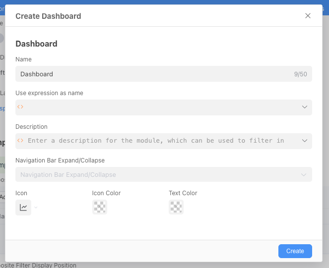
Now, you have entered a blank dashboard design canvas.
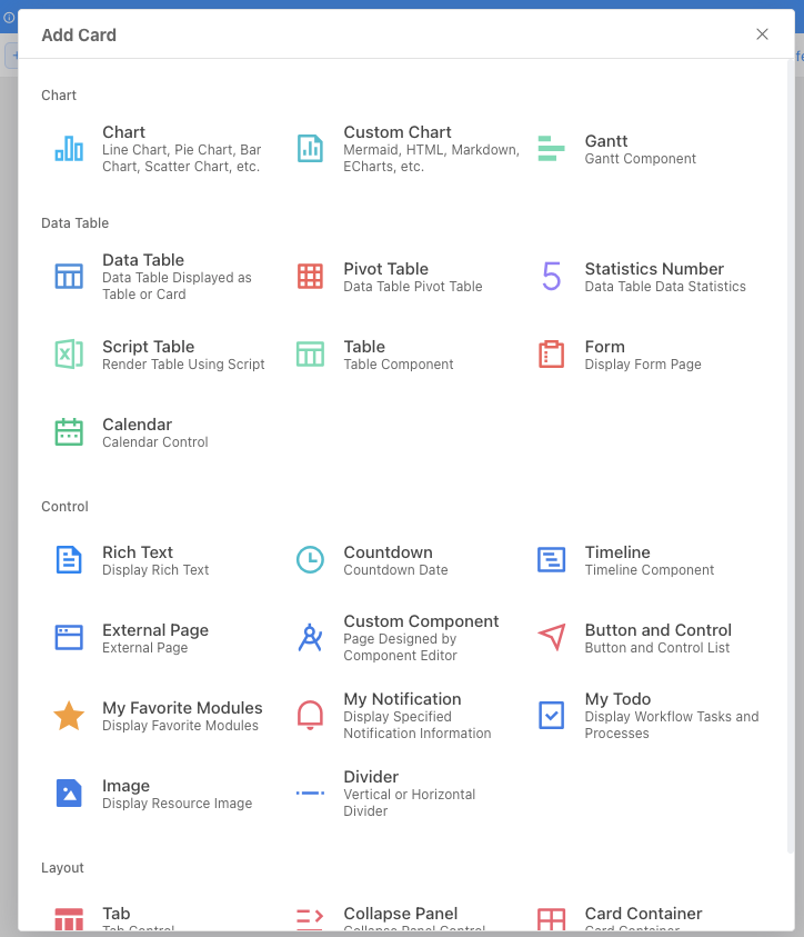
We will add three different types of cards that are all crucial for HR management.
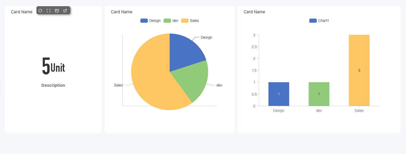
3.3.1 Card 1: Total Number of Employees (Statistical Number Card)
Purpose: Display the most critical indicator - total number of employees in the company with eye-catching numbers.
Select card type: Click "Create Card", select [Statistical Number] type.
Data configuration (query and count):
- Data table: Select [Employee Table].
- Enable aggregation query: Must be enabled because we need to calculate records.
- Aggregation column: Since we are counting the number of records, we don't need to group the data, so we can choose any field and select "Count" as the aggregation function.
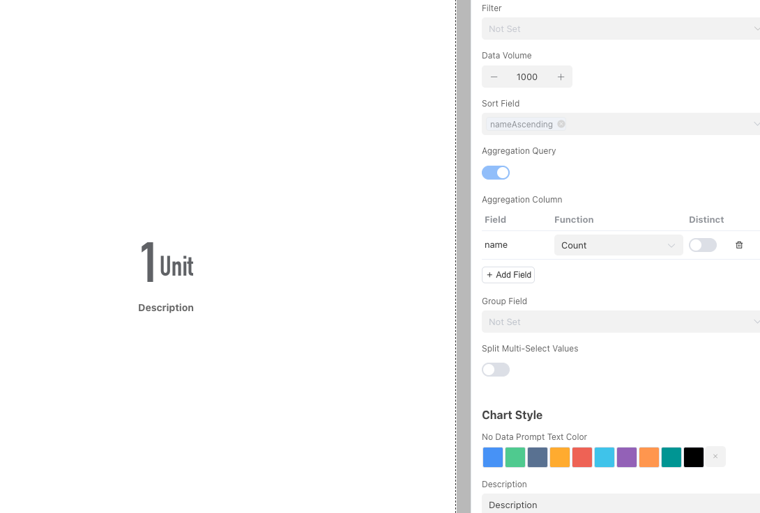
Style optimization:
- In [Settings], enter a "Name", such as "Total Number of Employees".
- Set "Unit", such as entering "people".
- Choose a bright "Color" to make this key number stand out on the dashboard.
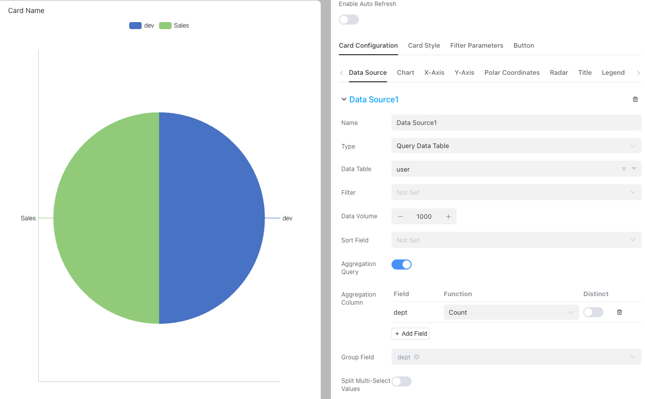
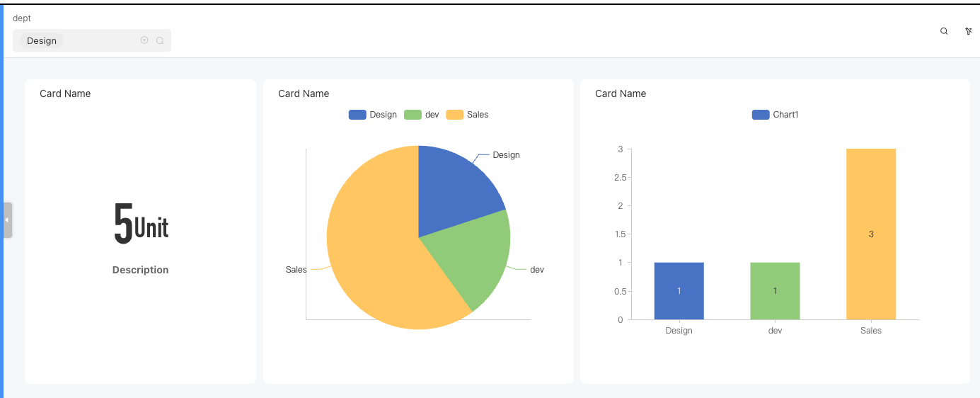
3.4.2 Card 2: Department Headcount Distribution (Pie Chart)
Purpose: Intuitively display the proportion of different departments in the company's total headcount.
Select card type: Click "Add Card", select [Chart] type.
Data configuration:
Click to add a new data source for the chart.
- Data table: Select [Employee Table].
- Enable aggregation query:
- Grouping field: Select "Department" field (this is our classification dimension).
- Aggregation column: Select "Count" of the Name field (count the number of people in each department).
Chart configuration: Add a chart in the [Chart] tab, select Pie Chart type, and we will see the data source is automatically used, then click Save.
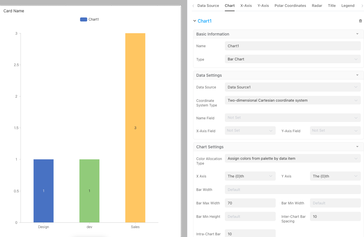
3.4.3 Card 3: Employee Age Distribution (Bar Chart)
Purpose: Help HR observe whether the age distribution of company employees is reasonable.
Select card type: Select [Chart] type.
Data configuration (date grouping):
- Data table: Select [Employee Table].
- Enable aggregation query:
- Grouping field: Select "Date of Birth" field.
- Grouping granularity: Important! You can choose to group by "year", "quarter", "month", or "day" to control the granularity of the trend. Since we are concerned with age, we choose to group by "year".
- Aggregation column: Select "Count" aggregation method for the Name field.
Chart configuration: Add a chart in the [Chart] tab, select Bar Chart type, and we will see the data source is automatically used, then click Save.
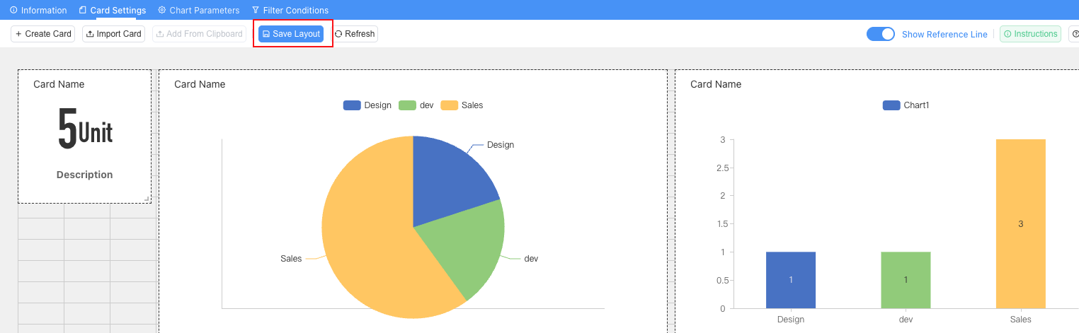
3.4.4 Card Layout
After adding multiple cards to the "dashboard", the system will arrange them in order, resulting in a messy page layout that is inconvenient to view.
To solve this problem, Informat's dashboard editor provides very intuitive and flexible drag-and-drop functions, allowing you to easily adjust the size and position of each component like organizing a desktop.
1. Adjust component position
You can move any component to any position on the canvas.
- Operation method:
- Move the mouse pointer over the component you want to move.
- When the mouse pointer changes to a cross arrow icon, hold down the left mouse button.
- Drag the mouse, and you will see the component follow your mouse movement.
- Drag it to your desired target position and release the left mouse button.
- Alignment hints: During dragging, you will notice background grids on the canvas. Components will automatically snap to the grid lines, and when the edges of components are aligned, auxiliary lines usually appear. Making good use of these features can help you quickly achieve neat arrangement of components.
2. Adjust component size
You can freely enlarge or reduce each component to suit its content display needs. For example, indicator cards are usually small, while trend charts or data lists require more space.
- Operation method:
- Move the mouse pointer to the lower right corner of the component's border.
- When the mouse pointer becomes a bidirectional diagonal arrow icon, hold down the left mouse button.
- Drag outward to enlarge the component, or drag inward to reduce it.
- Adjust to the desired size and release the left mouse button.
Finally, please remember: After completing all layout adjustments, click the Save Layout button at the top of the page, add viewing permissions for the HR Specialist role, and then publish your application so that users with the HR Specialist role can see the new look of your carefully designed dashboard.
3.5 Advanced Function Practice: Enabling Intelligent Interaction for Dashboards
Static charts are just information boards, while interactive dashboards are real "cockpits". Informat supports complex card interactions and data linkage.
3.5.1 Implementing Data Linkage: Global Filter Parameters
We want to set a filter at the top of the dashboard. After the user selects it, all charts in the dashboard can refresh data synchronously.
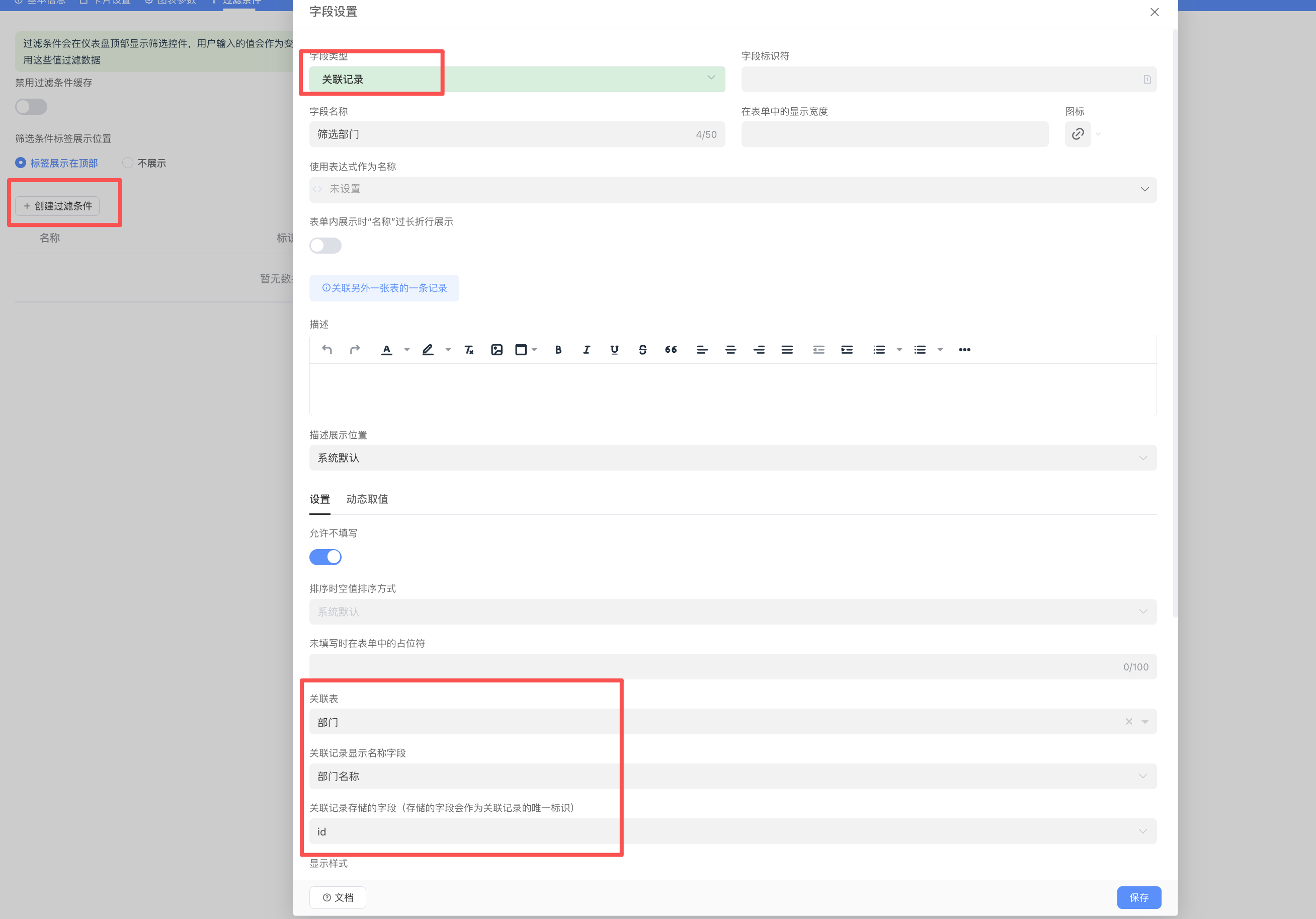
- Create filter parameters:
- Enter the [Add Filter] tab of the dashboard design interface.
- Create a filter condition, named "Filter Department".
- Set the parameter type to "Associated Record" and associate it with the [Department Table].
Apply the parameter to cards:
- Go to the data source settings interface of "Employee Birth Count".
- Find the "Filter" (filter) settings.
- Add a query condition:
Departmentequals, then click the arrow on the right side of the input box to enter the expression editor, and select the newly created query condition in the expression editor. - Because we want to display all data by default when no filter is selected, please check Ignore empty values after the filter condition, as shown below.
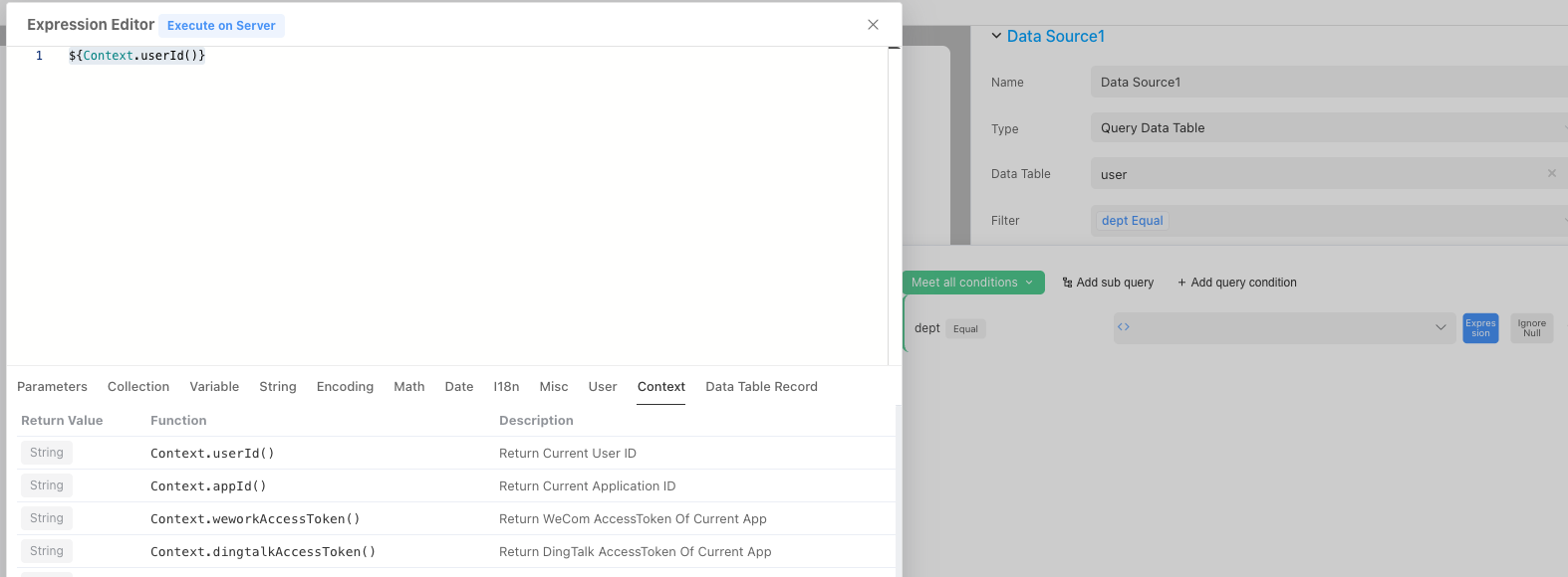
- Save the card and repeat this operation for other cards.
Effect: In this way, the "Filter Department" dropdown box at the top of the dashboard has global control. When the user selects "Marketing Department" in it, Card 1 (Total Number of Employees), Card 2 (Department Headcount), and Card 3 (Birth Age) will all only display data related to the Marketing Department, achieving efficient data linkage.
3.5.2 Data Drilling: From Charts to Data Records
Data drilling refers to the ability of the system to jump and display detailed data records behind an element when a user clicks on it in a chart (such as a sector of a pie chart, a bar of a bar chart). (Note: This function requires you to first master the use of Automation, which is a relatively advanced feature of Informat. You can come back to this operation after learning about automation in the future.)
- Configure card events:
- Double-click the "Department Headcount Pie Chart" card, enter the configuration interface, and find the [Events] tab.
- Select events: Informat supports Call automation on click and Call automation on double click.
- Design automation logic:
- Create a new automation program that will execute the "Open data table record list" step.
- Key: Pass parameters. In the automation step, you need to configure it to receive the department name variable passed when the user clicks.
- Filter list: In the parameter configuration of the "Open data table record list" step, set the filter condition:
Departmentequals[Department name passed from click event].
Effect: When the manager clicks on the "R&D Department" sector in the pie chart, the system will not jump to a new page, but pop up a window on the current page, displaying the detailed list data of all employees belonging to the R&D department. This experience greatly improves the efficiency of users in analyzing data.
3.5.3 Style Beautification and Theme Style
The style of the dashboard directly affects user experience. You can uniformly adjust the title, border, background, and various other specific styles of all cards in [Card Settings].